Studio News
Why Typography Is Still the Heartbeat of Great UX
Date:
2025
Most people never notice typography. But they feel it.

The same way you feel the difference between walking into a cheap hotel lobby vs. a well-designed one. The air shifts. The lighting’s better. You can’t always say why, but you just know something’s been considered.
Typography is that for digital products.
And it might be the most overlooked force in product design today.

The project that made this obvious
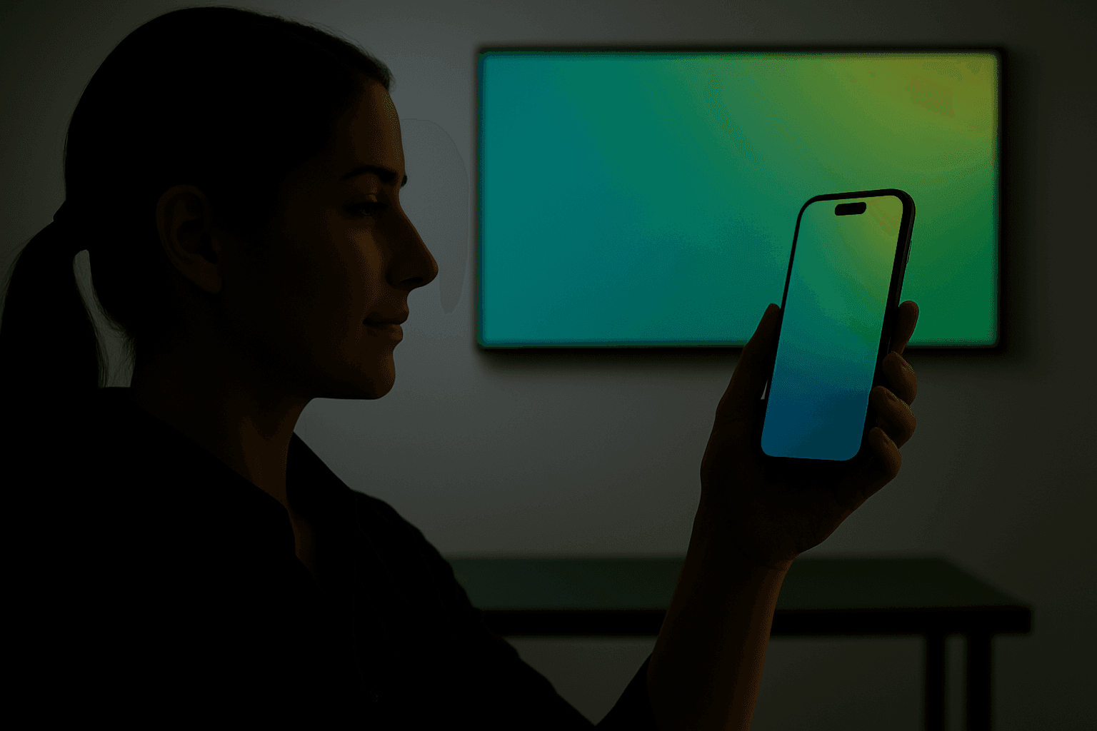
We were working on a fintech product. Solid backend. Sharp team. Great roadmap.
But user testing told a different story.
People weren’t sticking. They’d bounce halfway through onboarding, or worse, abandon the dashboard without ever engaging. No bugs. No obvious blockers.
Just that nagging bit of feedback:
“It doesn’t feel finished.”
“I don’t know if I trust it.”
This wasn’t a features problem. This was a perception problem. So we dug in.
What we found was a common issue: the structure of the product was sound, but visually, it lacked rhythm. There was no system holding the UI together. The typography was inconsistent, the spacing felt ad hoc, and the whole thing carried the weight of “MVP energy.”
So we didn’t add anything. We went back to basics.

The fix? Typography.
We rebuilt the interface around a modular type scale—using a 1.333 ratio.
We tuned vertical spacing so that each element flowed into the next with a sense of rhythm and calm.
We refined contrast.
We aligned everything optically—not just mathematically—because that’s what the eye feels.
No splashy animations. No new features. Just deep craft.
When we relaunched, users didn’t say “nice fonts.”
They said “this feels better.”
And they stayed longer.
Session times doubled
Onboarding completion shot up
Internal confidence returned
All because the product finally felt like it had weight. Like it belonged.

What typography actually does in a product
Typography sets the tone before users read a single word.
It communicates trust, clarity, intention. When the scale is off, or spacing is cramped, or contrast is low—it doesn’t matter how smart your tech is. The user feels it’s off, even if they can’t articulate why.
Here’s what great type unlocks:
Hierarchy → Guides the eye. Helps users scan, orient, decide.
Tone → Affects how serious, playful, or modern your product feels.
Trust → Consistency and clarity send a signal: “This is a real product.”
Readability → If it’s hard to read, it’s hard to trust.
And unlike trends or visual flair, typography compounds. Small improvements add up across every screen and state. It’s one of the few places in product design where foundational craft always pays dividends.

If you want to sharpen your type craft, here’s what we focus on:
Modular scales (1.25x or 1.333x for balance and flow)
Vertical rhythm (consistent spacing between text blocks and UI elements)
Max line lengths (60–80 characters for readability)
Optical alignment (especially for forms and CTA blocks)
Contrast ratios that meet accessibility standards
Platform-specific tuning (don’t just scale your web styles for mobile—rethink them)
These are quiet decisions. But they change everything.

Final thoughts
Typography is the heartbeat of great UX.
It carries rhythm.
It communicates tone.
It anchors the product experience.
It doesn’t scream for attention. It doesn’t go viral on Dribbble. But when it’s right, the product feels like it belongs. And when it’s wrong, everything feels unstable—even if the features are brilliant. So next time a user says something feels “off,” don’t start with onboarding. Or features. Or animations…
Start with the type.